Change the Lens Through Which You Visualize Data Using Principal Components Analysis
Rob Sickorez
Senior Data ScientistWhen enterprises apply data science tools and techniques to their business data, they gain insights and predict outcomes, but only if they understand the interrelationships of the data they are analyzing. When it comes to working with unfamiliar data that comprises many elements, this can be challenging and take time, especially when with understanding the correlative relationships between many continuous variables. Some machine learning approaches refer to these relationships as predictive power. Here we present an approach for doing this using a data visualization technique: principal components analysis.
Suppose that you inherit a large dataset and you want to make sense of it. By large dataset, we mean one that has many measurements recorded on each observation. For example, suppose you are given fifty measurements for each of one hundred twenty-eight NCAA Division 1 FBS football programs. That is there are n = 128 observations, each representing one football team, and p = 50 variables to describe each team’s performance on the field.
You might begin the exploratory data analysis by examining two-dimensional scatterplots of the data. But this can quickly become labor intensive and unproductive. In fact, choosing two variables at a time to generate scatterplots means that you would need to examine 1,225 scatterplots to account for all fifty variables in the dataset. Very few of the scatterplots would be informative since each contains a small amount of the total information contained in the dataset.
In fact, we don’t need fifty variables to represent each college football team. Some pairs of variables are highly correlated. When a pair of variables are correlated, it means that one variable doesn’t provide any new information beyond that provided by the other variable. When that happens, we have two measurements that basically provide the same information about the given observation. In this case, our two dimensions are essentially just one dimension.
Principal Components Analysis (PCA) is a technique that helps us choose a small number of dimensions that contain as much of the variability in the dataset as possible. PCA is an indispensable tool in data visualization for unsupervised learning. PCA is also useful in supervised learning because it enables us to derive variables that do a better job than the original variables at filtering out noise. This helps us to avoid overfitting a model to the data.
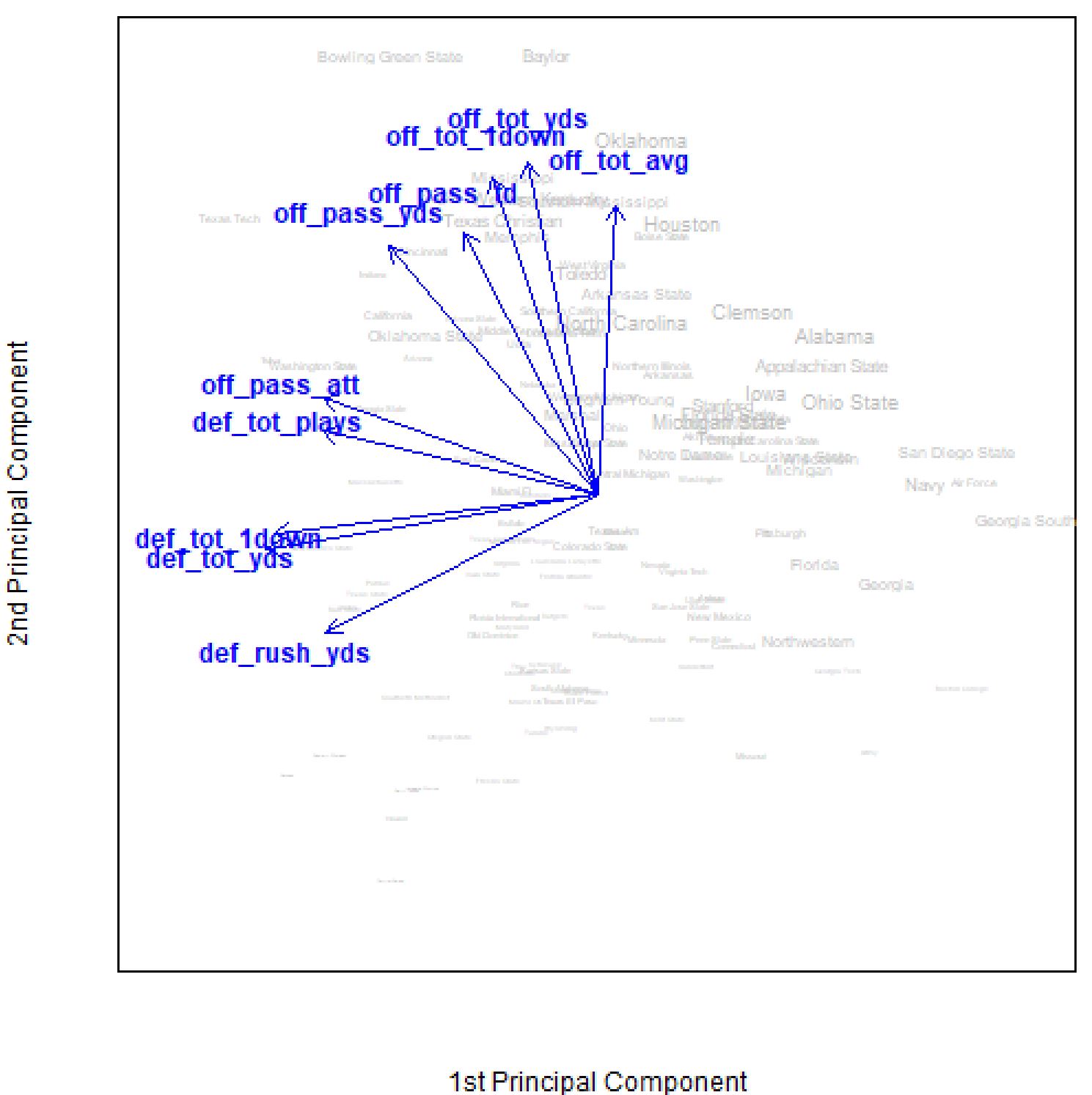
Consider Figure 1, which shows a two-dimensional representation of the college football dataset. Here, PCA has made it possible to visualize all 128 observations in terms of two components that combine the information contained in numerous variables from the dataset. This biplot packs a lot of information into a two-dimensional plot. By looking at this plot, we can discover how different teams and performance measurements in the dataset are related to each other. Using this plot, we can summarize the dataset, and hence college football, as follows. The NCAA FBS football teams differ most with respect to their overall offensive and defensive performance. However, offense and defense are largely uncorrelated. This means that having information related to a team’s relative offensive performance does not help you predict their defensive performance, and vice versa. Furthermore, suppose you were told that the font size used for each team is proportional to their winning percentage, which is in fact the case. Then, you would likely conclude that winning teams have higher than average offensive statistics and lower than average defensive statistics (i.e., more favorable because on defense they allow fewer yards, first downs, etc.). Thus, simply from looking at a picture of a dataset in two-dimensions, you could explain the principal way in which college football teams in this dataset vary and what makes winning teams different from losing teams. Obviously, there was some information lost in this dimension reduction, but PCA ensured that we lost as little as possible in this transformation. We only looked at the first two principal components. By looking at subsequent components, we can extract more information from the dataset.
The natural question that should come to mind is, how many more components should we use to adequately represent the dataset? The answer depends, of course, on the nature of the data and the goal of the analysis. If we are using PCA as part of supervised learning, for example to predict a team’s winning percentage, then we have a response variable that can be used to check our work, so to speak. In that case, we can use cross-validation to determine the number of components that lead to the most accurate predictions. We can think of the number of principal components to be used in the regression as a tuning parameter to be optimized.
In unsupervised learning, like in the early stages of an exploratory data analysis, it’s less clear how to proceed. In this case, we conduct an ad-hoc visual analysis using scree plots. A scree plot shows the proportion of variance explained (PVE) by each principal component, which is essentially the fraction of information contained in each component. The first principal component always has the highest PVE, followed by the second principal component, and so on. When PCA is called for, PVE will be high for the first few principal components and then drop off quickly for subsequent principal components.
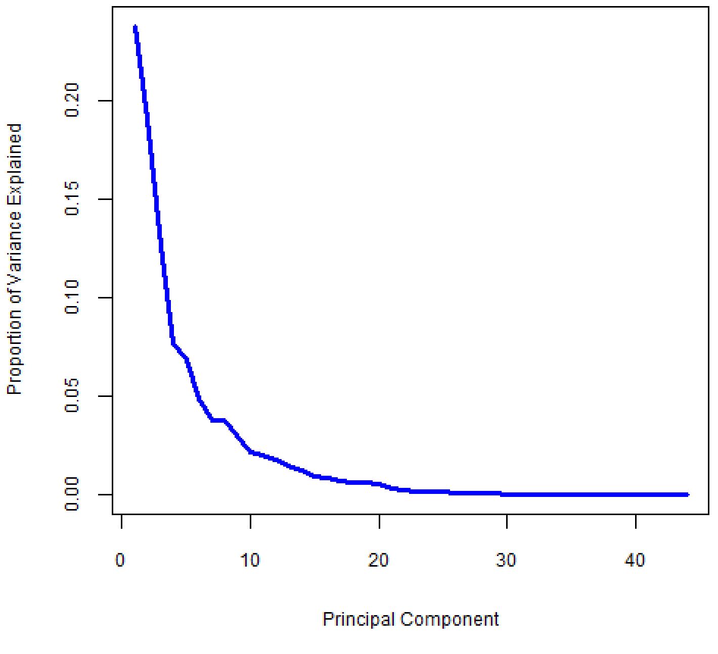
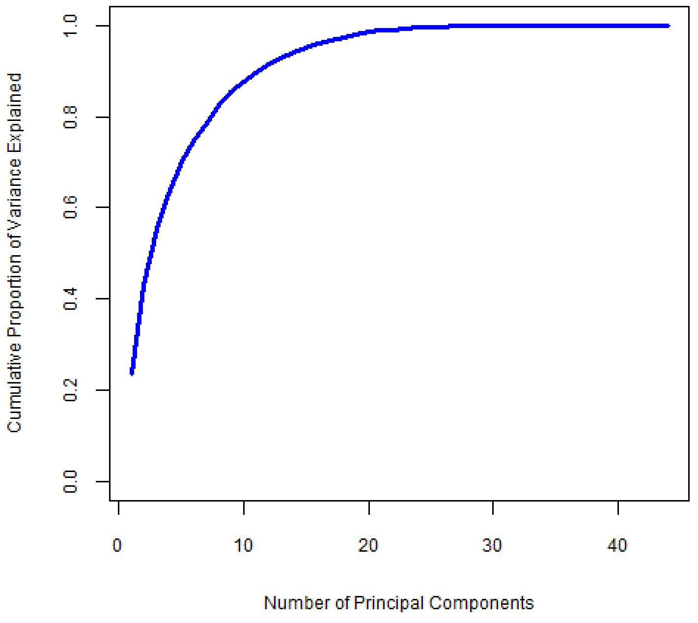
We want to select the smallest number of principal components that will explain most of the variation in the dataset. We look at the scree plot and find the point at which the proportion of variance explained by each subsequent principal component drops off and the curve begins to flatten out. We call this point the “elbow”. In the scree plot in Figure 2, this point appears to be near the eighth principal component. Figure 3 shows the cumulative PVE, which tells us how much information we have captured based on our choice of how many principal components to use. The first eight principle components account for about 80% of the total variability, or information, in the dataset.
While eight principal components is a considerable reduction in dimension from the original fifty variables, it’s still a lot to wrap our head around. In practice, we tend to look at the first few principal components to find interesting patterns in the data and then continue investigating subsequent components until we are unable to find any more interesting patterns. The key is being able to describe in words what the components mean.
Each principal component is a weighted sum of all the variables in the dataset. For a given component, the weights will be larger for some variables than others. The blue arrows in Figure 1 depict the ten variables that had the largest weights (in terms of absolute value, since weights can be either positive or negative) for the first two principal components. Even though a weight was assigned to all variables as part of the PCA procedure, we didn’t plot arrows for the remaining forty variables for ease of interpretation. As a rule, you want to be able to interpret the weightings assigned to the variables so that you can communicate the meaning of each selected component in terms that make sense in terms of the problem at hand. For the college football dataset, the first principal component can be described as the team’s defensive ability (or inability) because the largest weights were assigned to variables that relate to defensive performance. It is usually easier to do this if you mask the less important variables so that you can focus on those with the highest waits in analyzing each principal component. This is one area where art meets science. It takes some practice and experience before you will be comfortable thinking along these lines.
It is important to understand what PCA is and what PCA is not. PCA is not a variable selection method. It doesn’t discard any variables from modeling or analysis in the way that a stepwise regression procedure or some other data reduction techniques might. Every variable from the dataset is used in every principal component that is calculated. Even if we only use one or two principal components, the information from all variables will be incorporated into those one or two components.
Also, PCA doesn’t make value judgements on the data. By this we mean that PCA doesn’t imply that certain observations are good or bad relative to each other. PCA can help us identify clusters of similar points, but there is no implied ranking of these clusters against one another. It also doesn’t suggest that high (or low) values of a variable are better (or worse) than the opposite. PCA helps us better understand the variability in a dataset by spreading out the observations as much as possible along the selected number of dimensions and by filtering out noise introduced by redundant sources of information. Principal components analysis is a technique that helps you clearly visualize your data so that you can extract the information and draw conclusions, leading to a better understanding of the interrelationships in your data. Though PCA will not directly draw conclusions for you, it can be a foundational exercise that leads to building the right kinds of statistical models or setting up the right machine learning processes that will lead to conclusions, insights, and predictions.
-
About the Author
Rob Sickorez serves as the Senior Data Scientist at Expert Analytics and has 15+ years’ experience providing technical leadership and supporting decision-makers in numerous industries. He began his career as an Air Force officer with a critical project, based on his Master’s thesis, that created an automated process for officer career field assignments that was quickly adopted and deployed by the general in charge of all Air Force personnel. After his Air Force career, he was successful on many assignments including predicting payouts for compensation and incentive programs, designing marketing and retail tests, behavioral and credit risk modeling, automating shift-scheduling and workforce planning, and automotive pricing and inventory management. Rob has strong competency in developing insightful, interactive solutions to empower decision-makers at all levels of organizations to improve productivity and profitability.